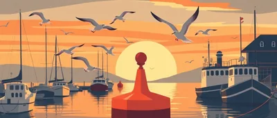
The Gulls Kept Landing on the Buoy Icon
For a stretch of a couple of months the little buoy icon in the browser tab kept getting mistaken for something else entirely — three separate people told me it looked like a gull sitting on driftwood rather than a striped buoy bobbing in the water.
I hadn't drawn it with a gull in mind at all, but once it was pointed out I couldn't unsee it either. The stripes I'd meant as a marker buoy pattern turned into wing shading if you squinted, and the little brass cap on top did look uncannily like a beak from certain angles.
I sat with it for a while before deciding whether to redraw it. Redesigning a favicon feels like a small thing until you actually try it — everything has to read clearly at an almost illegible size, and a shape that looks fine at full size can turn to mush shrunk down to a tab.
In the end I kept the buoy but squared off the top and darkened the stripe gap slightly, enough that it reads as a buoy again without losing the charm of the accidental gull. A few people have mentioned missing the gull look, which I take as a good sign the little icon was doing its job either way.
It's a strange thing to spend an evening on, redrawing eight pixels of a tab icon, but small details like that are most of what building this site actually is day to day.